
|
|
|
|
|
OTHER PROJECTS
|
|
|
|
|
|
|
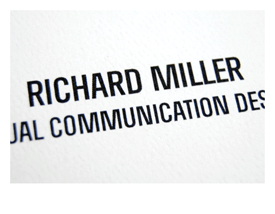
RICHARD MILLER
A condensed display typeface appropriately named because it started as a typographic logo/mark to be used for my name. I was inspired by other condensed faces like Din and Trade Gothic which both have straight sides for most letters. All diagonal strokes have the same weight and are slid horizontally to create a rhythmic balance between positive and negative forms, as opposed to traditionally making them smaller to compensate for each character's width.
A condensed display typeface appropriately named because it started as a typographic logo/mark to be used for my name. I was inspired by other condensed faces like Din and Trade Gothic which both have straight sides for most letters. All diagonal strokes have the same weight and are slid horizontally to create a rhythmic balance between positive and negative forms, as opposed to traditionally making them smaller to compensate for each character's width.
© RICHARD MILLER 2008